Outside is better
Client
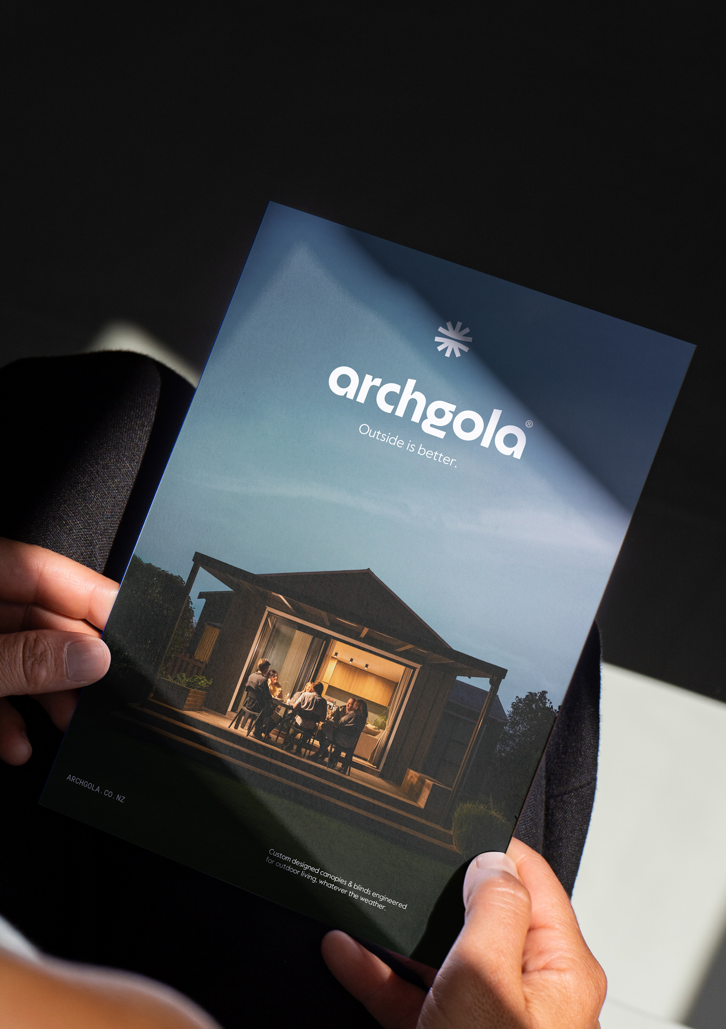
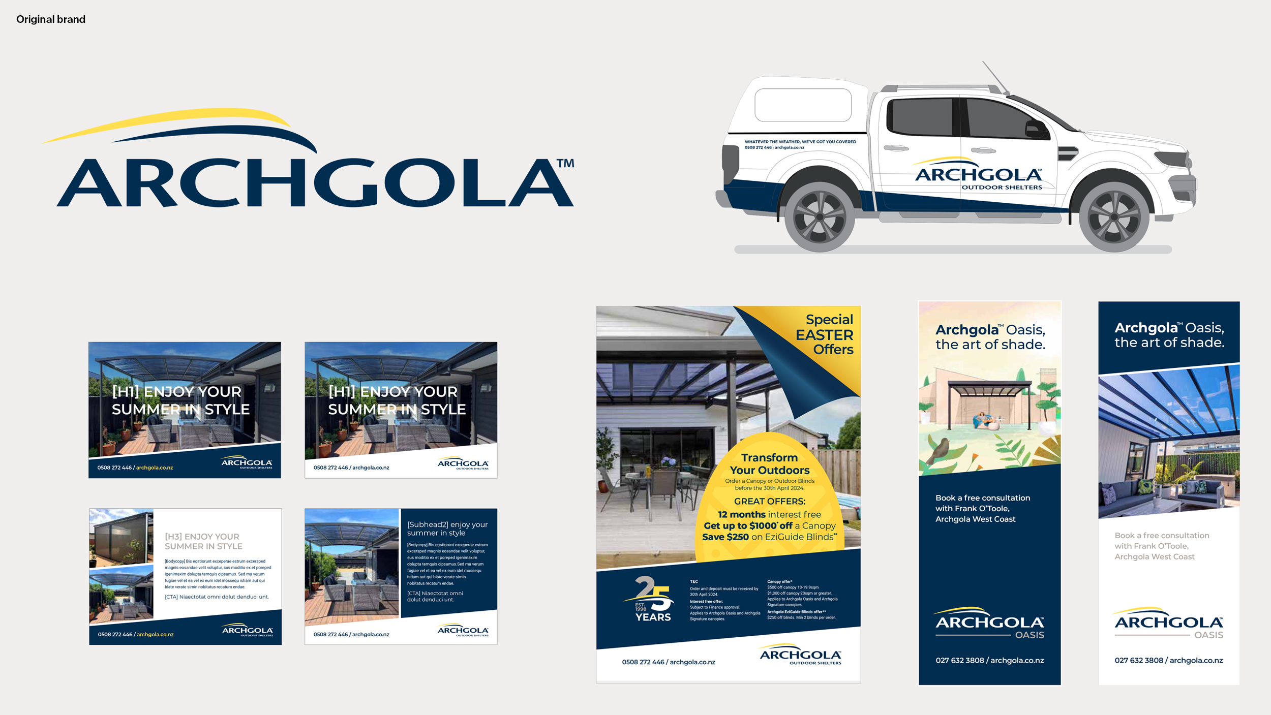
Archgola
scope
Strategy
Identity
Digital
sector
Retail
The Background
For over 25 years, Archgola had been a classic Kiwi company, renowned for building solid, long-lasting canopies. They were the go-to for durable outdoor shelter, a brand people trusted. However, the market, and modern Kiwi lifestyles, had changed. While reasons for purchasing a canopy still related to protection from the elements, the real emotional hook was wanting to enjoy life outdoors. Archgola’s image needed an upgrade to look modern and aspirational —a bit less 'shed' and a bit more 'designer living'. They needed to shift from being just a product seller to a provider of awesome outdoor living solutions, ensuring they could connect with new homeowners and stay competitive.

The Strategy
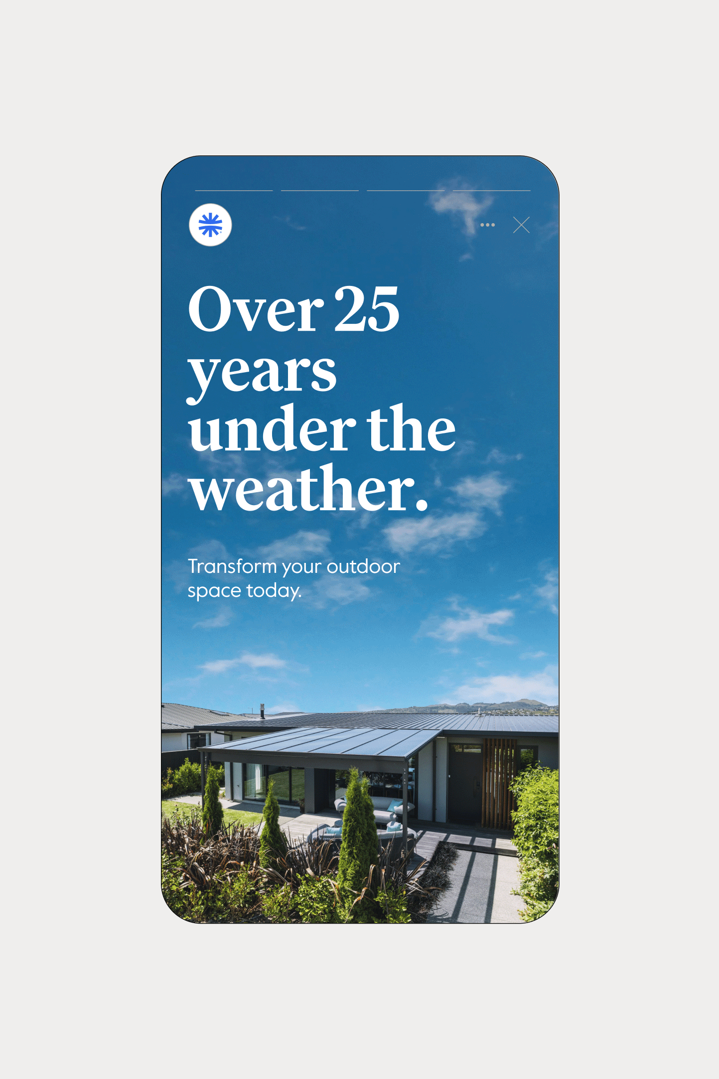
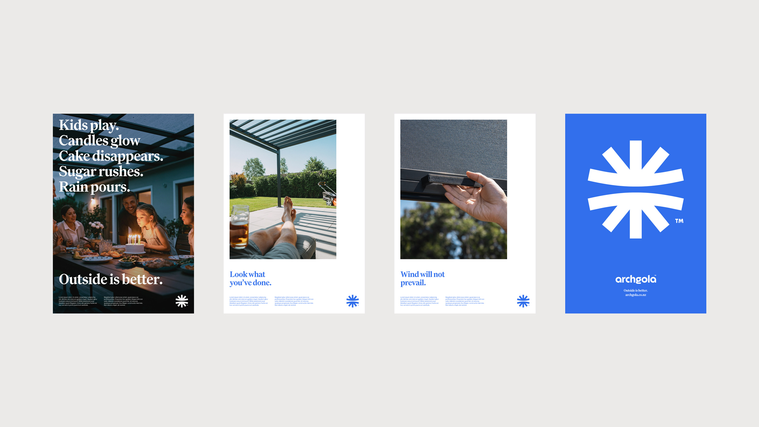
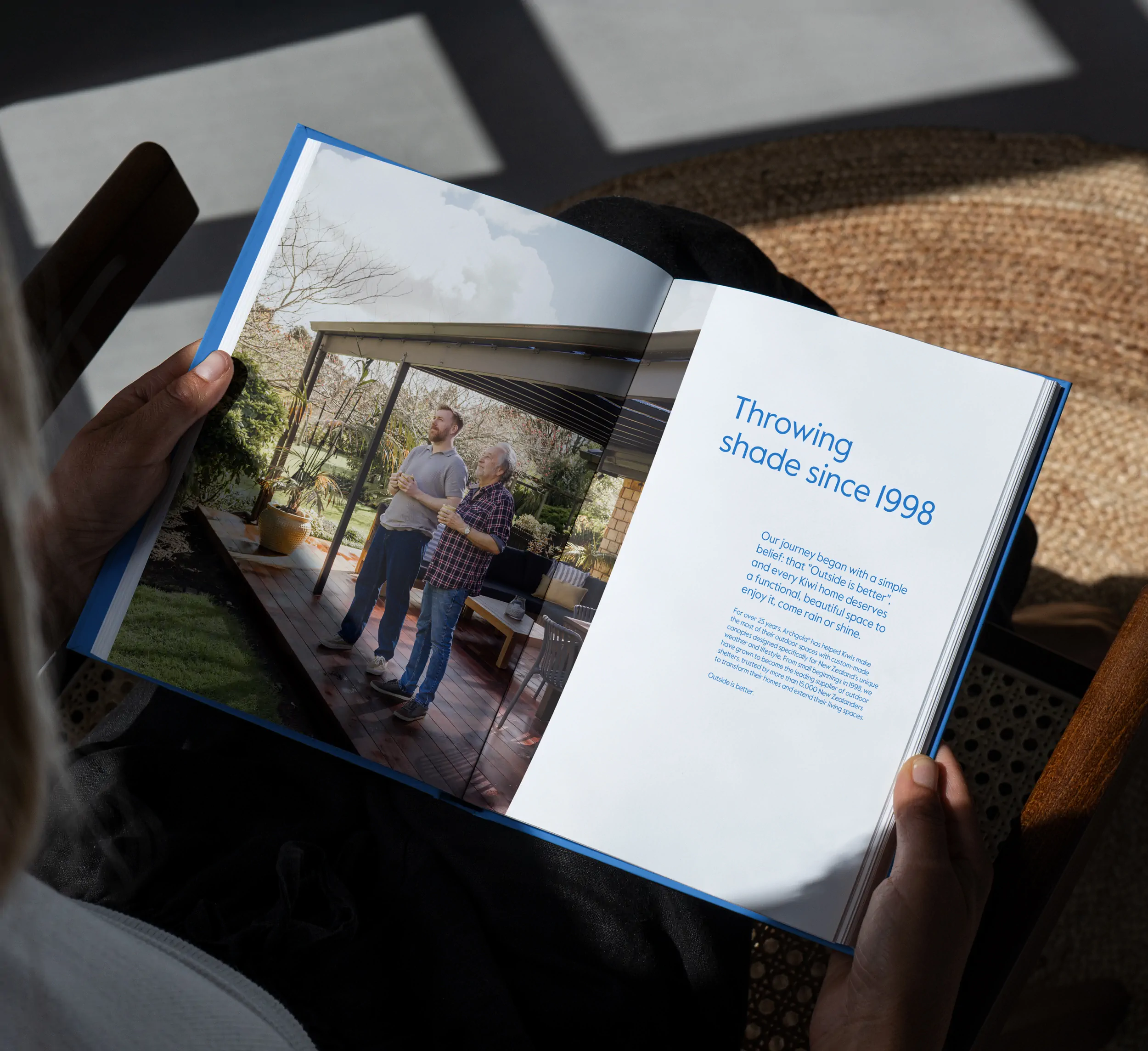
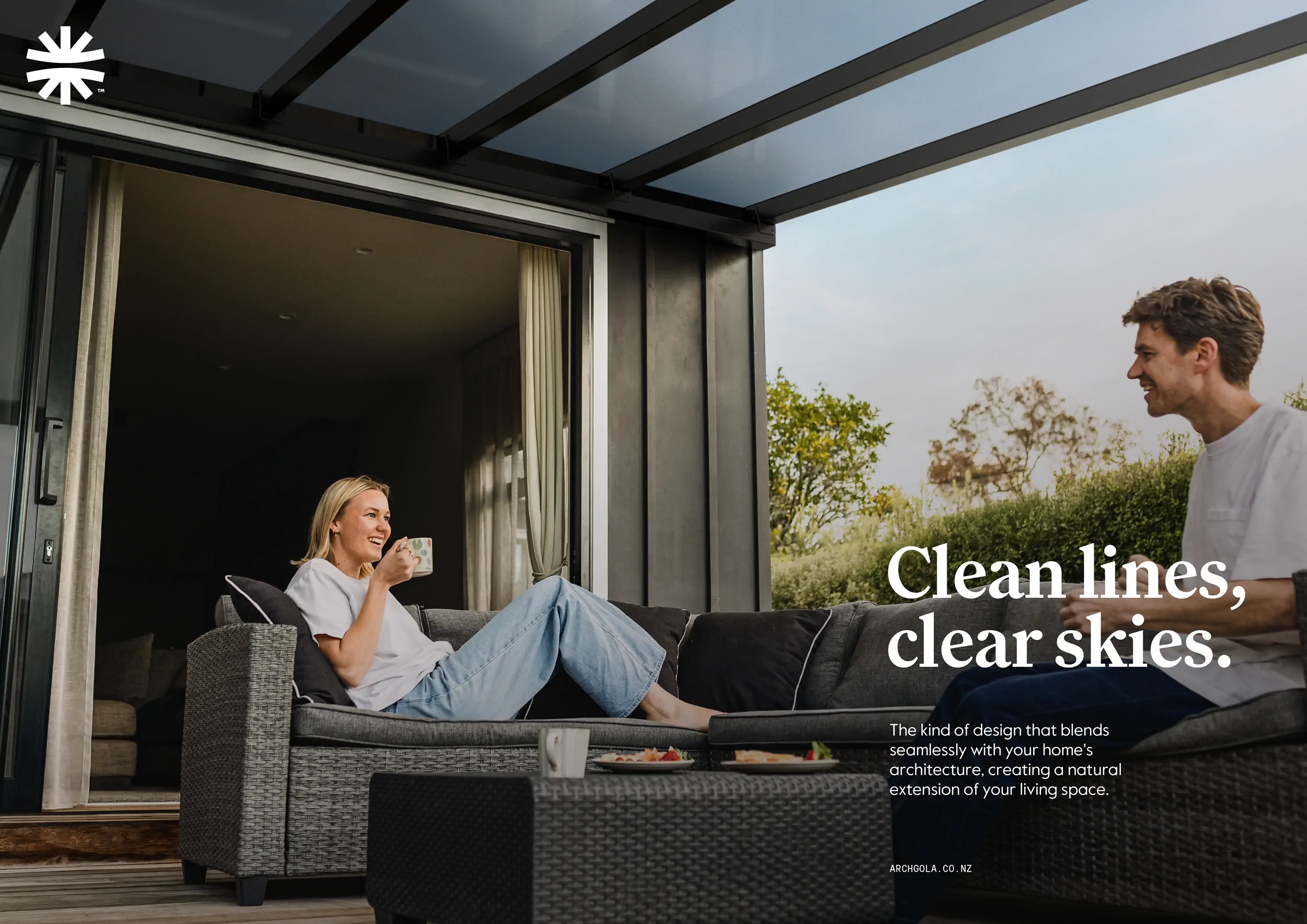
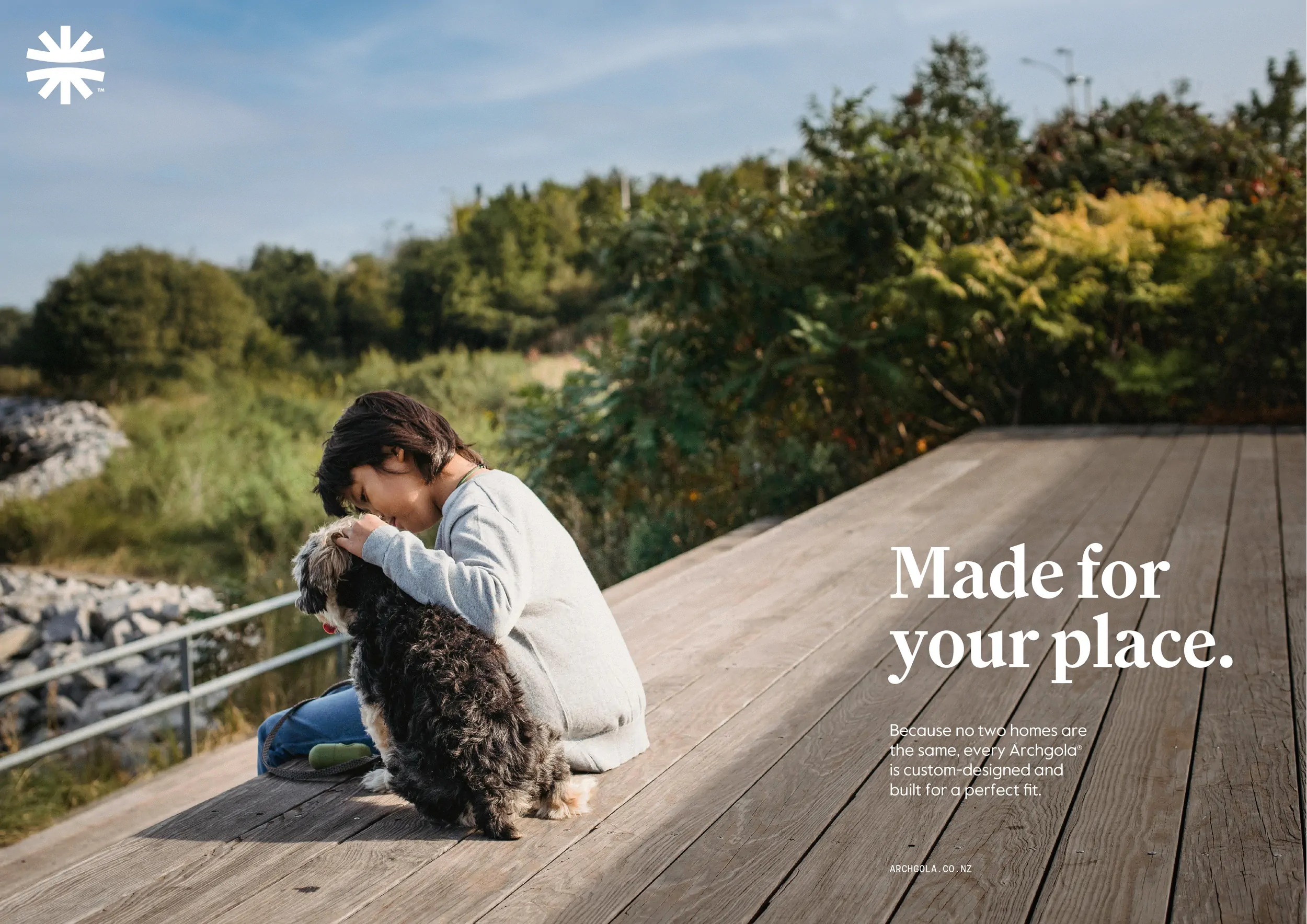
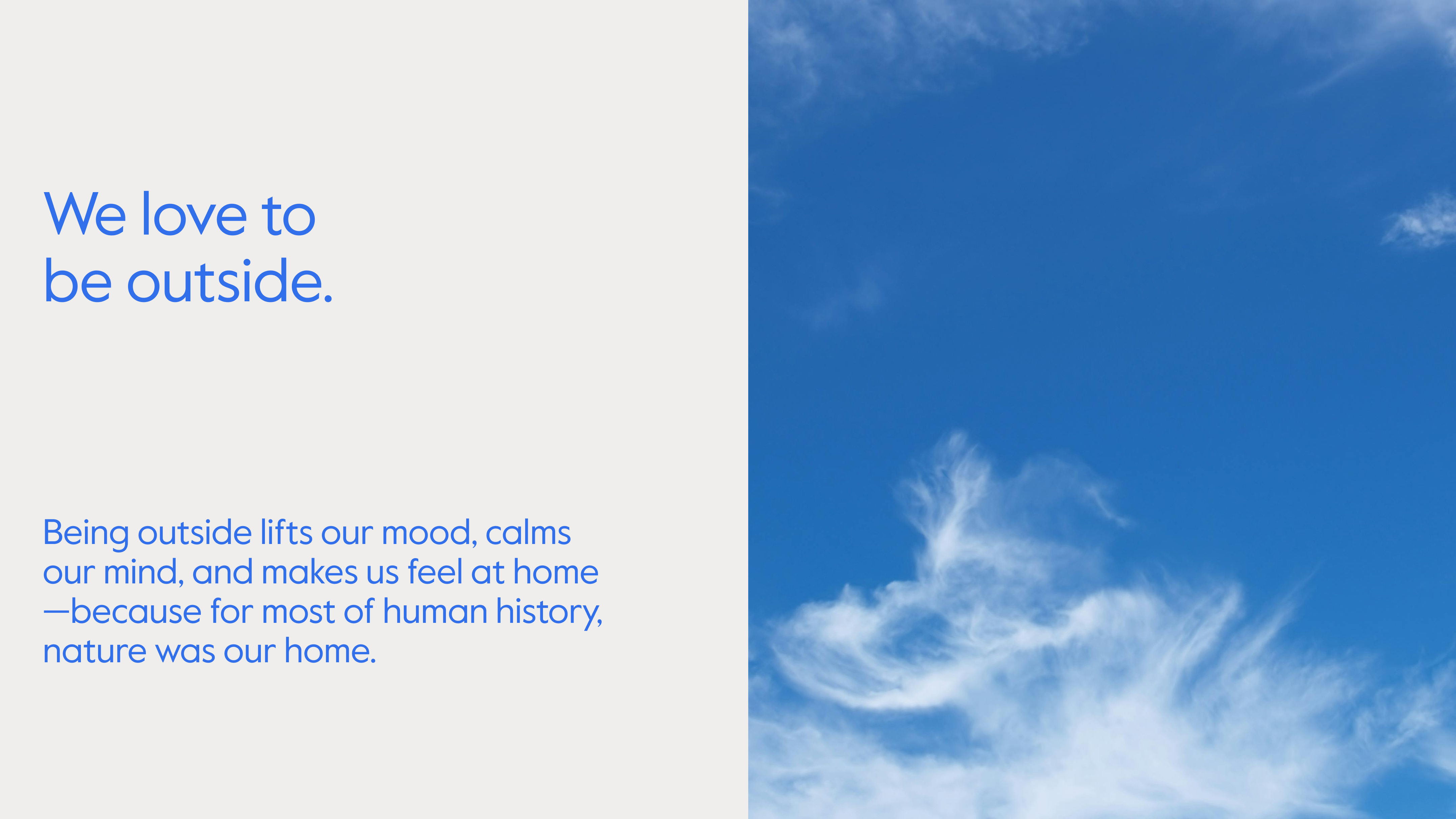
The entire rebrand pivots around one simple, universal truth: "Outside is better". This is the brand's heartland, the foundation they can always rely on. The goal was to stop just talking about the product and start talking about the lifestyle - the BBQs, the family gatherings, the quiet cuppas under cover. The brand platform aims to elicit feelings of belonging, reassurance, and enjoyment from customers. This strategy is backed up by what makes Archgola the real deal: they offer unparalleled customisation options for a perfect fit, deliver solid performance and longevity to handle NZ’s weather, benefit from a trusted heritage since 1998, and provide a seamless experience through professional installation and support with licensees in 27 regions.
The Solution
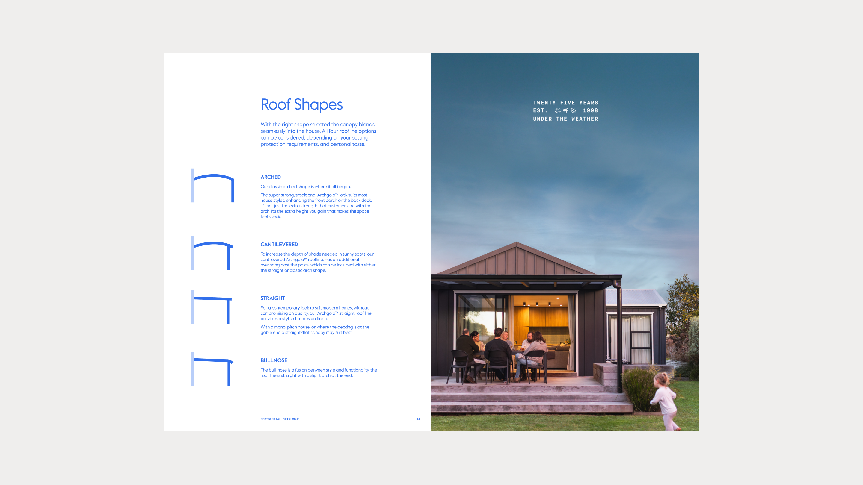
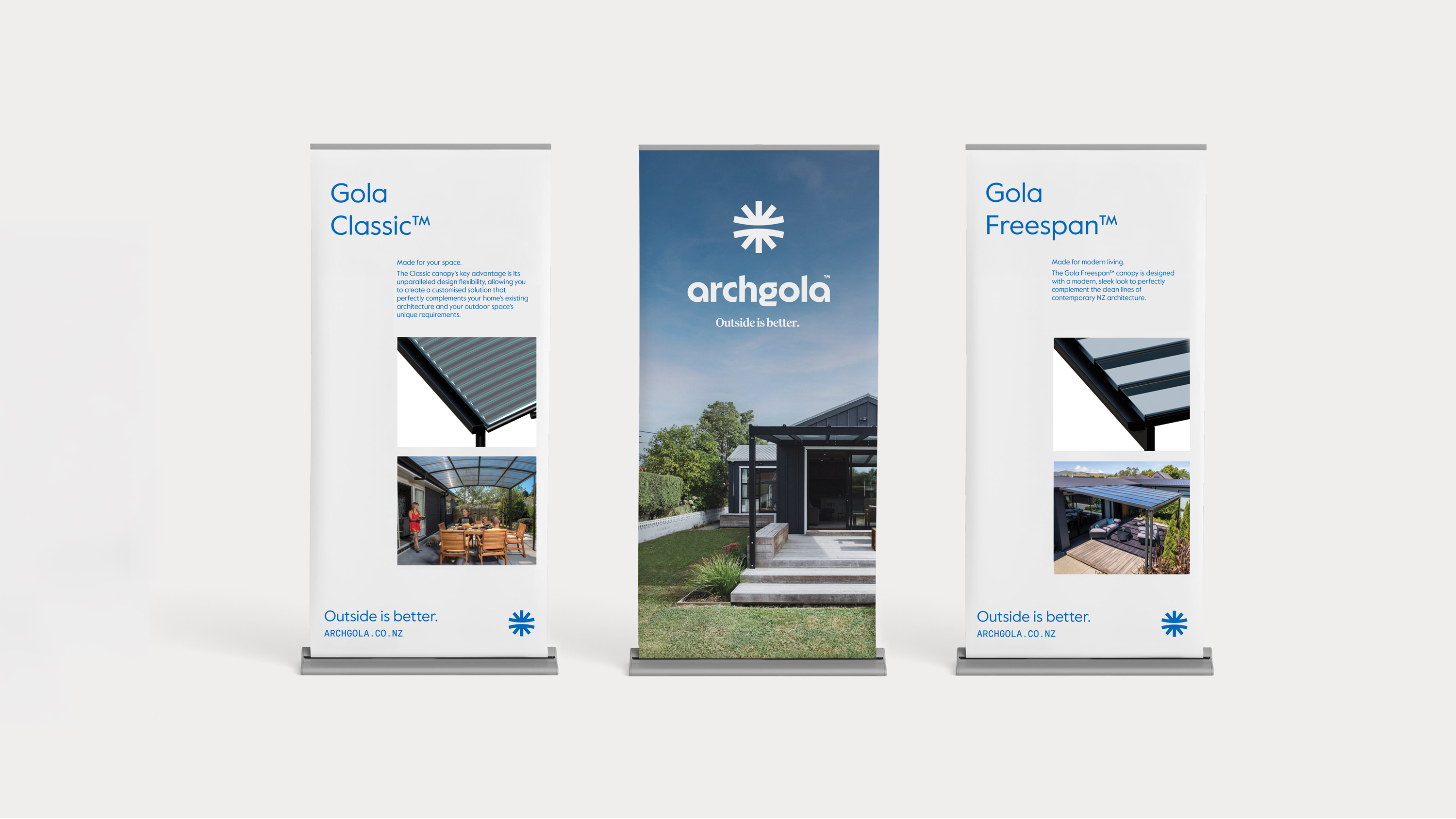
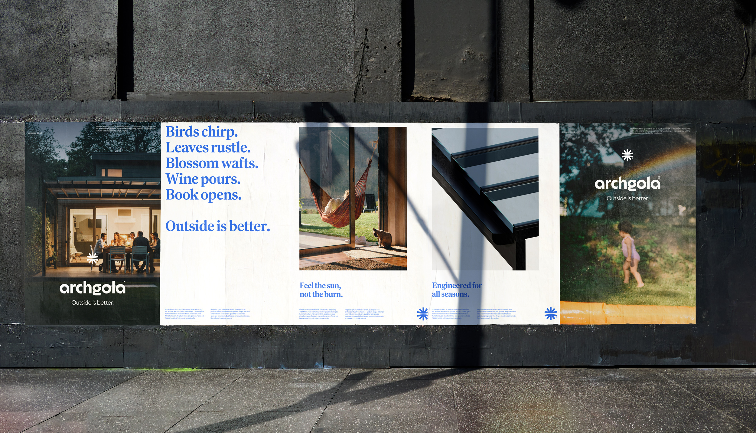
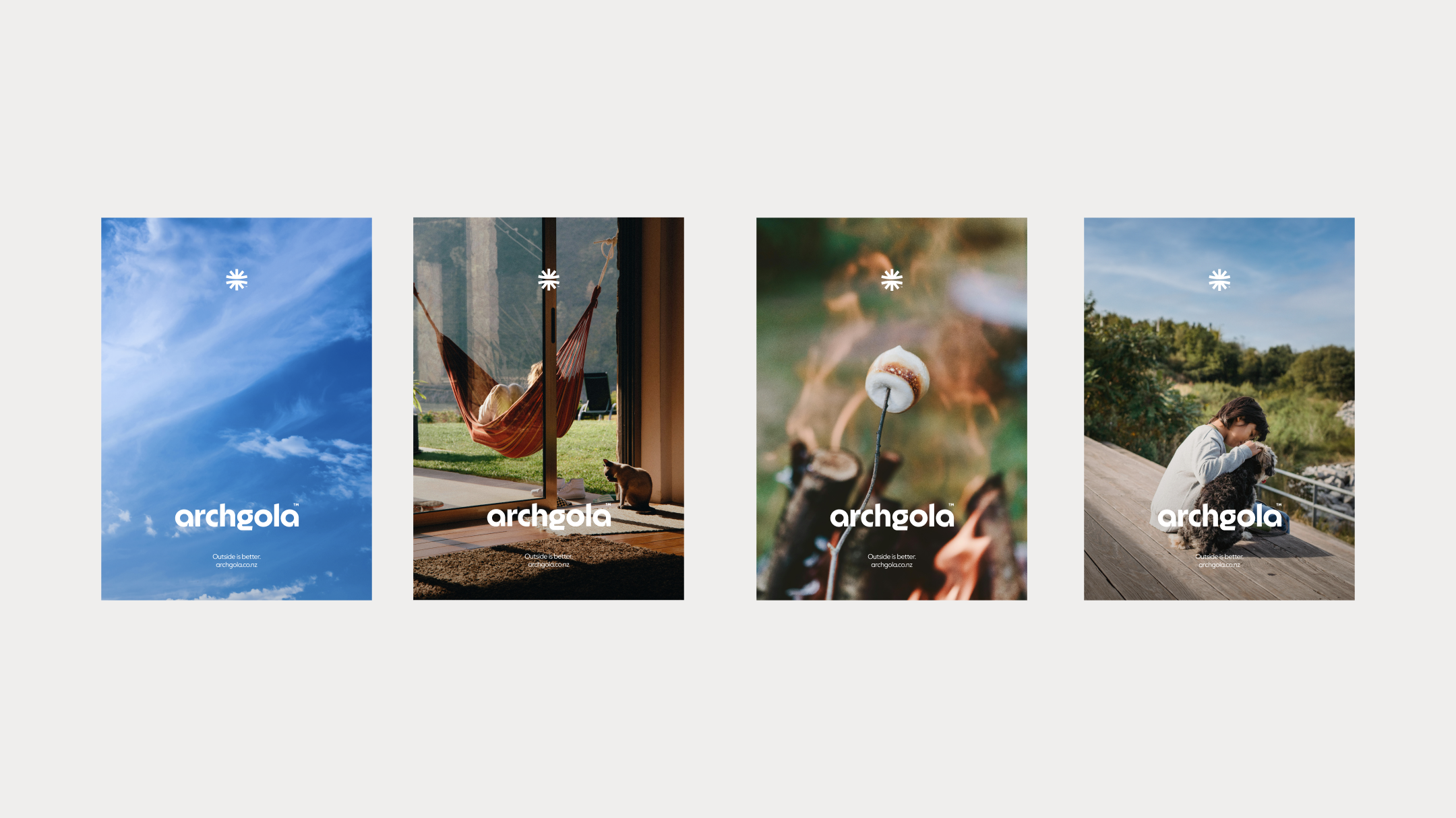
The new brand needed to feel confident, down-to-earth, and easy to relate to. The identity strikes a balance between warmth and precision. The archgola wordmark is relaxed yet engineered, while the stylised blue sun captures the simple joy of being outdoors — its curved form hinting at a canopy providing shelter. Sky Blue anchors the palette alongside a calm range of neutrals. A clear font system keeps things practical: Family leads the headlines, Value Sans does the heavy lifting, and RM Mono adds a touch of technical detail. The tone of voice is conversational and distinctly Kiwi — confident without being showy. Messaging focuses on real benefits and everyday moments: Shade that fits. Engineered for all seasons. It’s gotta be a ‘gola. Sun sets. Friends chat. Fire crackles. Beer opens. The detailed renders we created were also key part of the rebrand — bringing the product to life, helping customers compare options, and solving the challenge of something notoriously hard to photograph. They made the experience more tangible, guiding people through real choices with clarity and confidence.

The Outcome
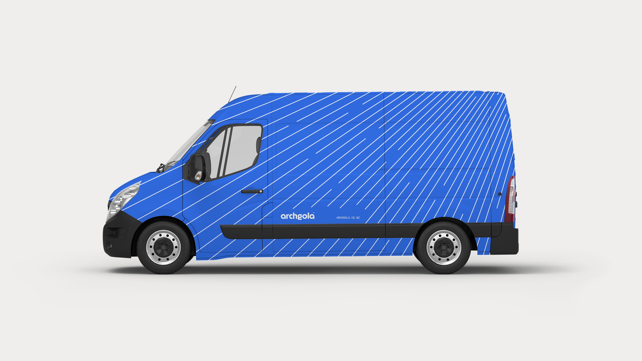
The entire system - from the sharp logo on the delivery van to the clear messaging in the ads - ensures Archgola is showing up consistently and confidently across all platforms. This rebrand is about making Archgola the clear choice for anyone wanting a functional, stylish extension of their home, transforming the outdoors into a space people love to use. By connecting emotionally and leveraging their history of trust, Archgola is set up to remain the market leader and thrive with the next generation of Kiwi customers.
Credits

©MMXXII Daymark Studio Ltd, all rights reserved. Privacy Policy.
