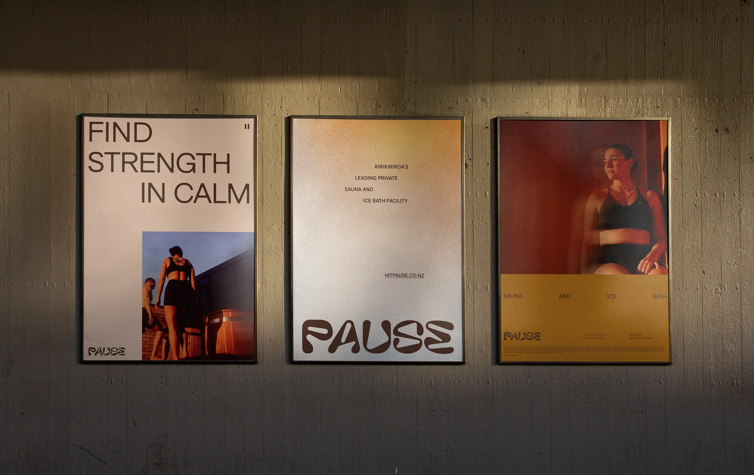
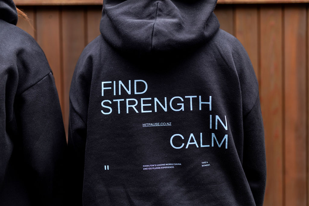
Find strength in calm
Client
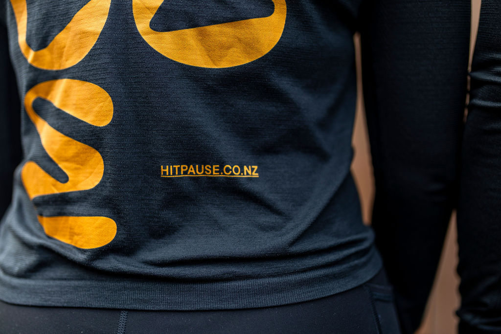
Pause
scope
All Projects
Digital
Identity
Naming
Strategy
Web
sector
Hospitality
The Background
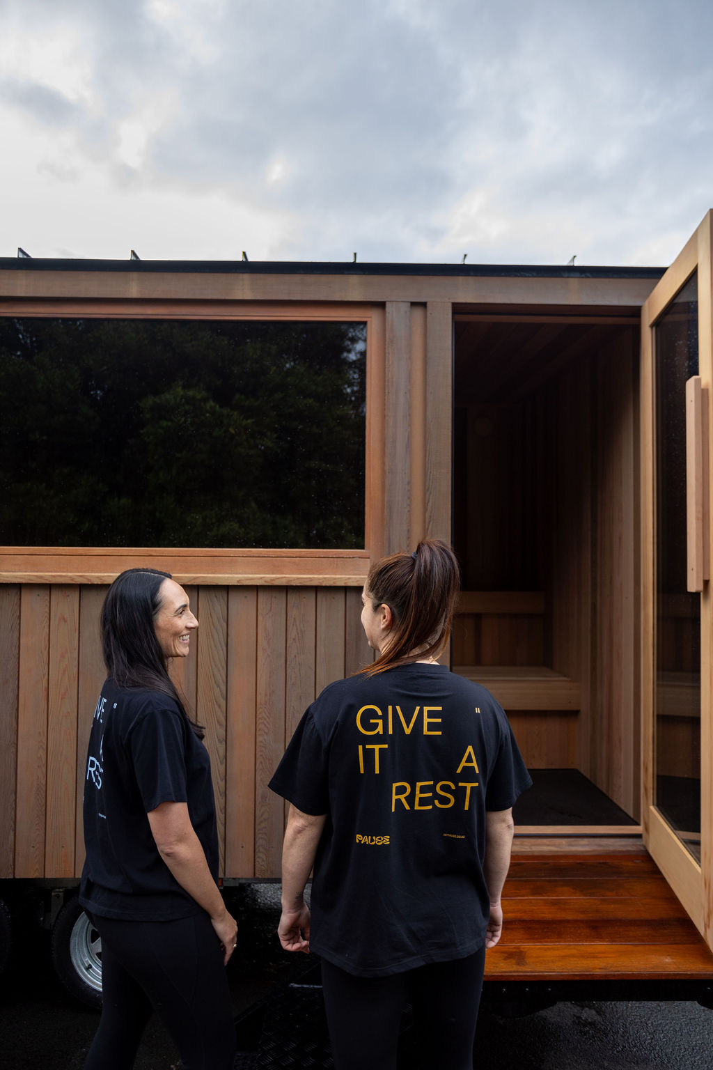
Lauren and Maysie met as frontline Police Officers in Hamilton, where they discovered the importance of recovery alongside training. After experiencing the immediate benefits of contrast therapy firsthand, they set out to create Pause — a mobile sauna and ice plunge experience for those needing to regain energy. The challenge was positioning Pause within Hamilton’s emerging market of recovery services, without the typical spa or wellness centre associations. They wanted to create something grounded and real — a brand that reflected their own energy and no-nonsense approach, while still communicating therapeutic credibility and approachable quality. It needed to feel authentic without falling into cliché, and remove barriers around convenience and accessibility.
The Strategy
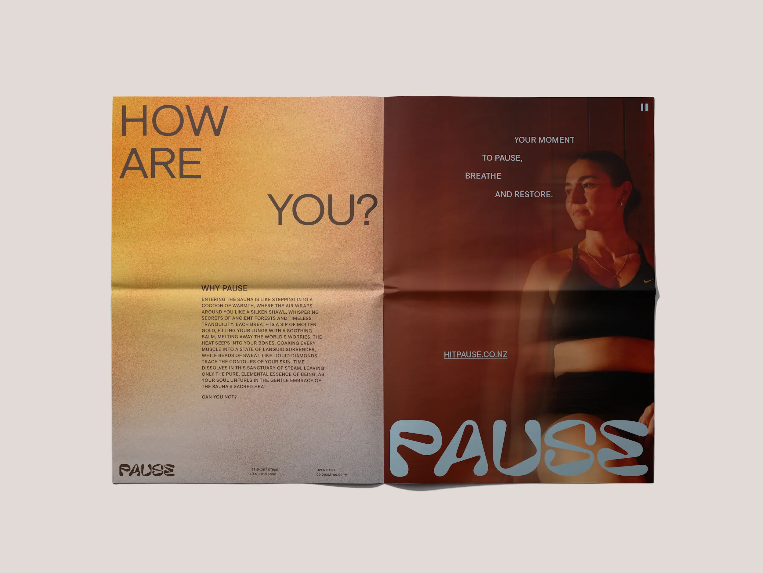
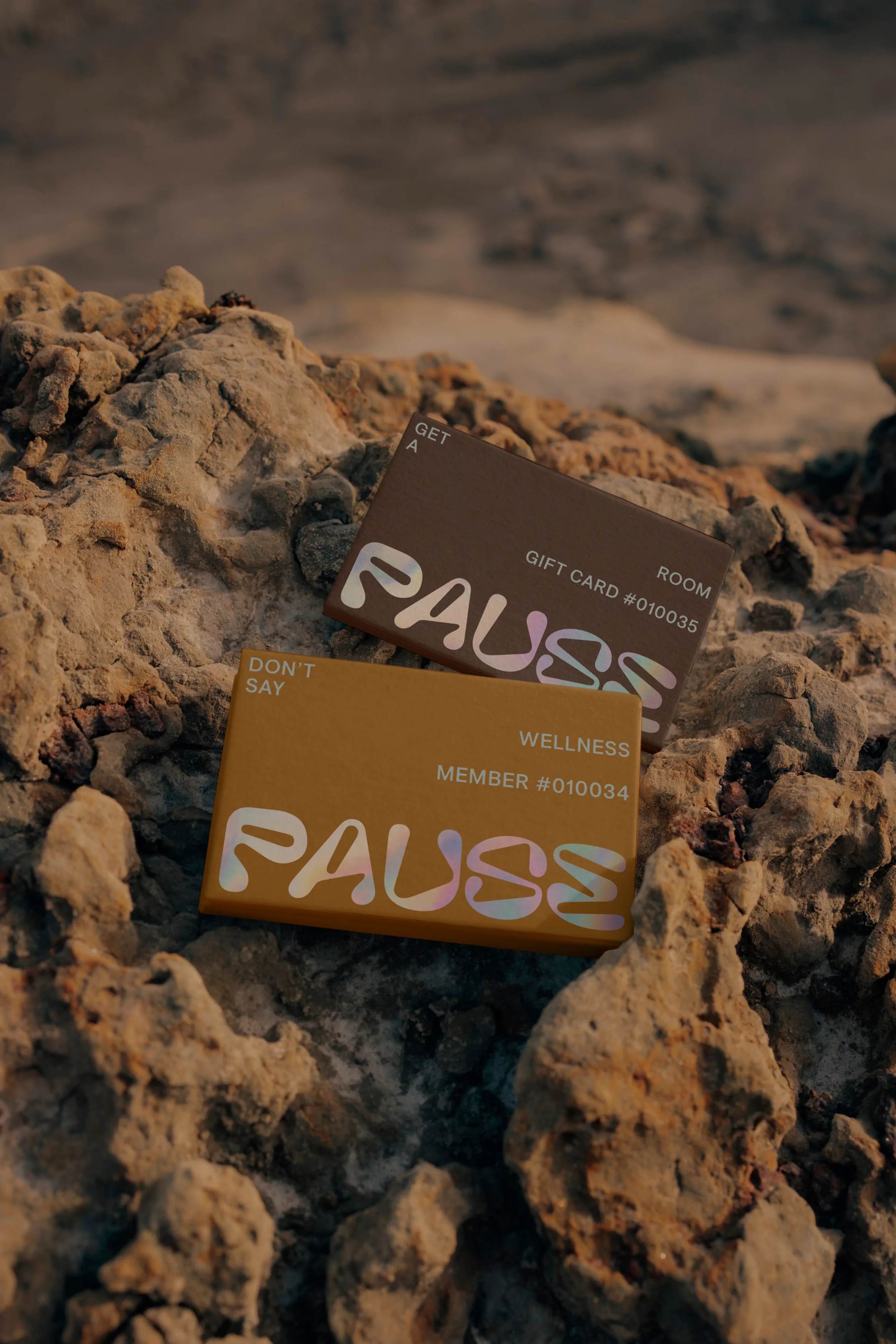
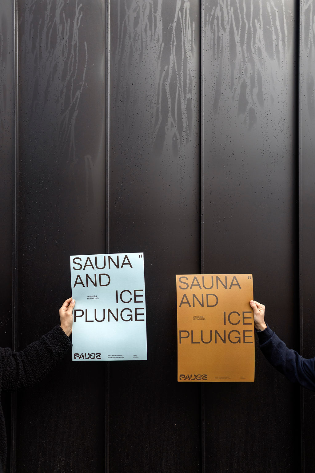
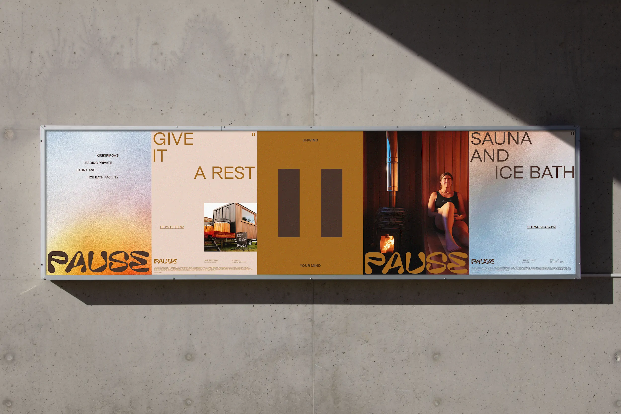
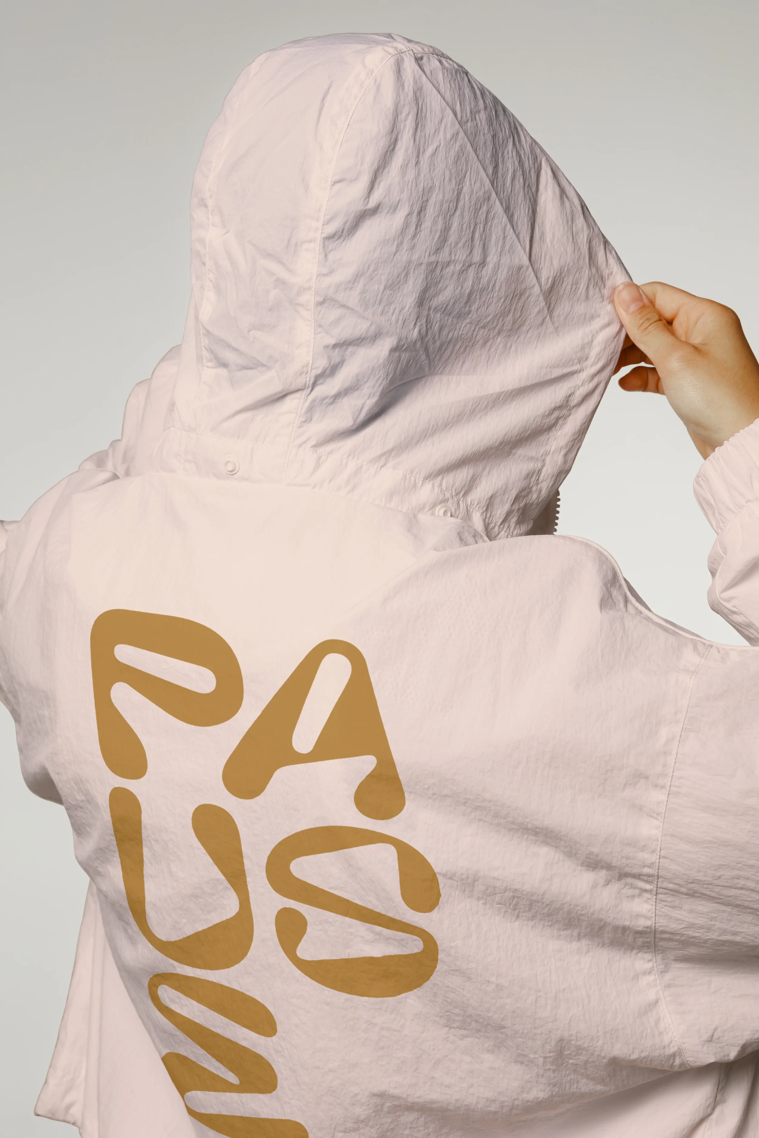
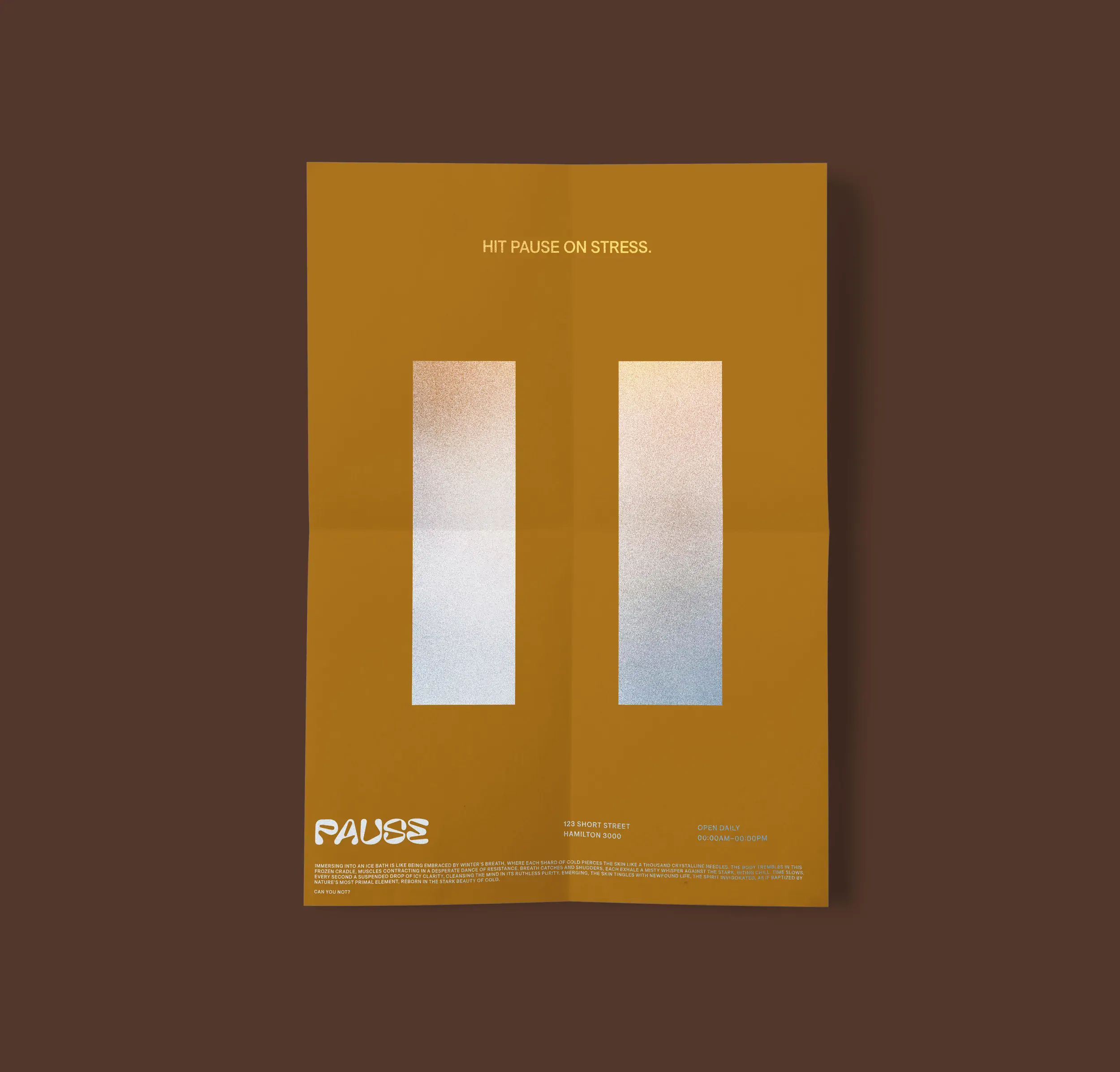
The brand platform Find Strength in Calm centred on contrast and invited customers to experience the transformative power of Pause. The brand personality stemmed from deep care for people, community, and authentic spaces for self-restoration. The visual identity needed to be identifiable and scalable across diverse touchpoints — from vehicle and portable signage to an online platform and social media. Every element was designed to build clarity and trust around a service that was accessible, immersive, and uplifting.
The Solution
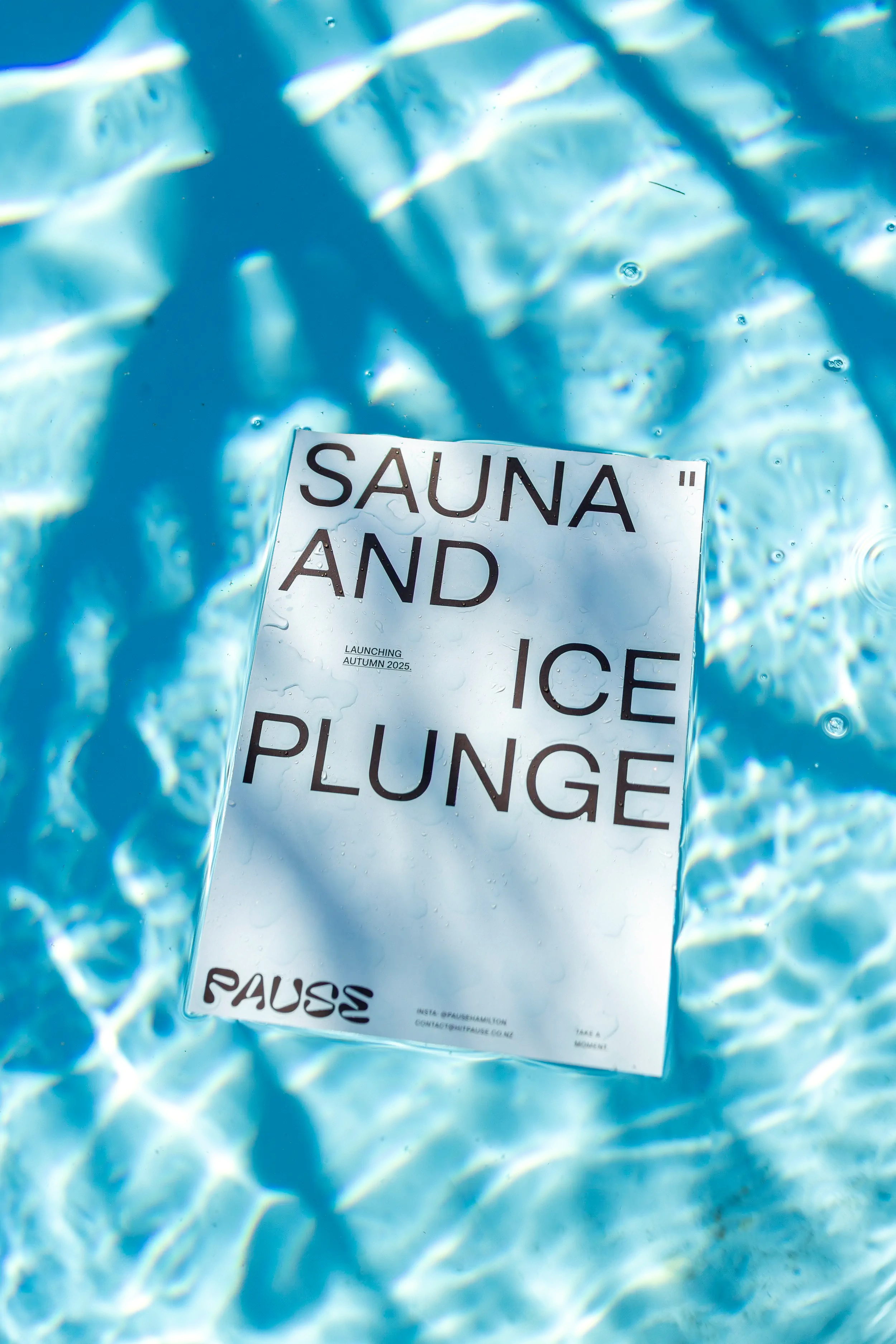
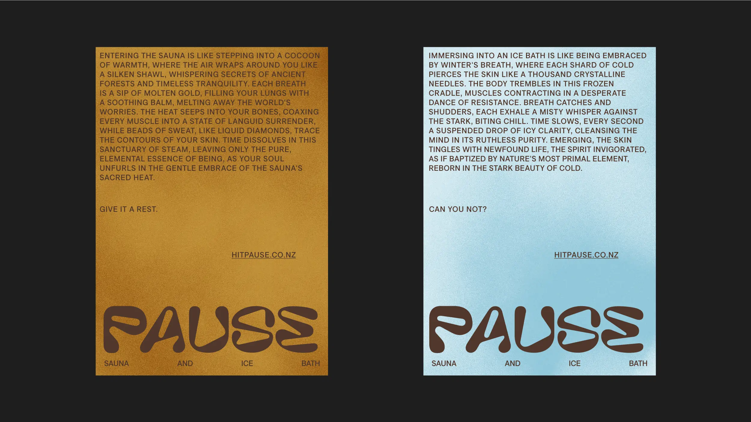
The wordmark was designed to express contrast through form — balancing organic and rigid shapes, dynamic and static elements, hot and cold cues. It aimed to capture the interplay between fluid energy and controlled geometry, creating something distinctive within the recovery and wellness space. The colour palette drew directly from the contrast therapy experience: warm cedar tones representing sauna heat, cooling blues reflecting the ice plunge, and soft whites symbolising the clarity that emerged from the practice. This system worked across all applications while remaining distinctly non-clinical. The visual language introduced contrasts throughout — focused and energetic, minimal and rich, calming and invigorating.
The Website
The digital experience mirrored the physical, guiding visitors through an online journey of contrasting language, colours, and textures. Clean typography and calming, authentic visuals echoed the focused environment customers encountered, while the website’s emphasis on taking a moment to “pause, reset, and find strength in calm” created a seamless transition from digital discovery to physical experience.

©MMXXII Daymark Studio Ltd, all rights reserved. Privacy Policy.
