Creating Realities
Client
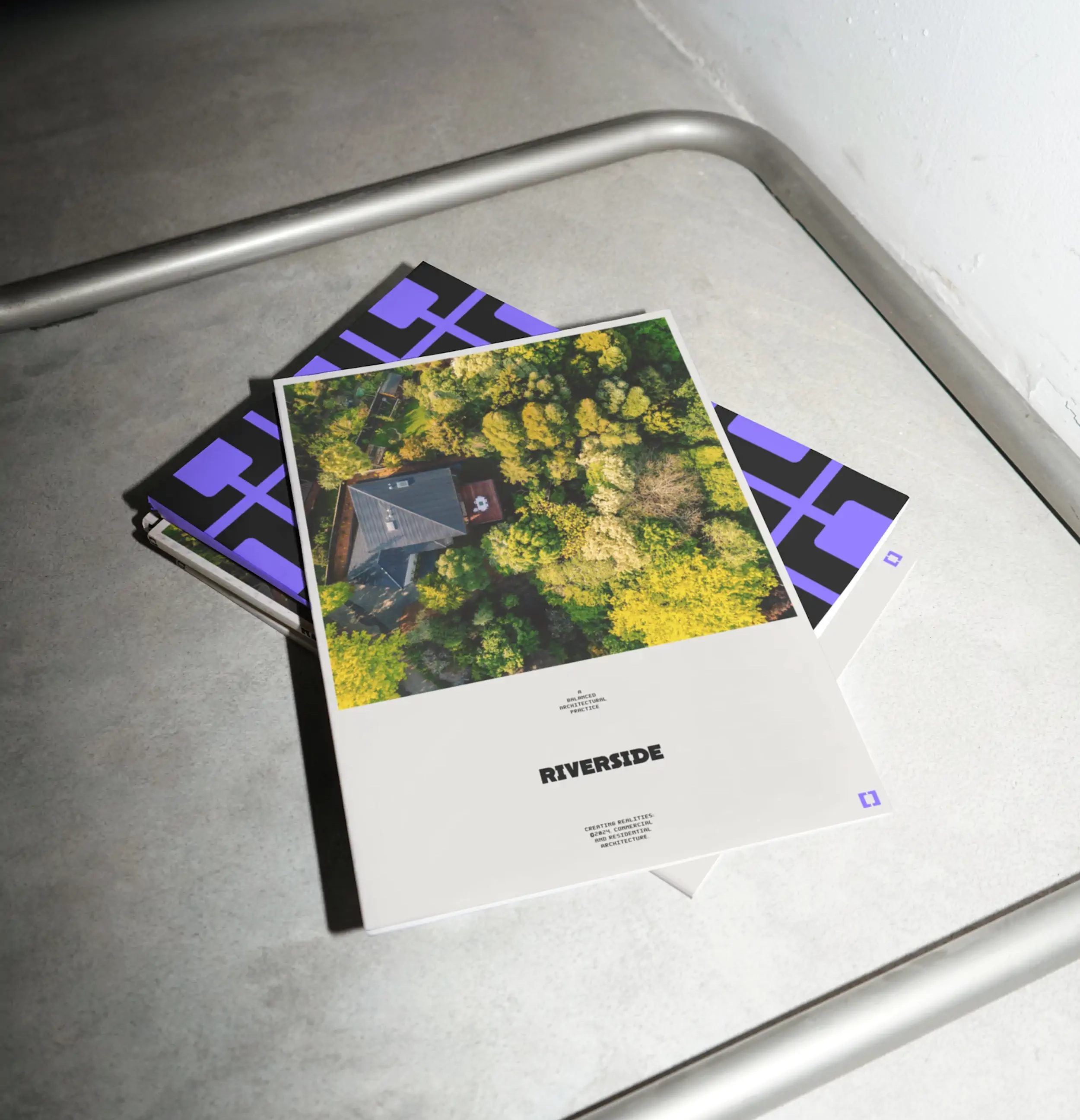
Riverside
scope
All Projects
Digital
Identity
Strategy
sector
Property
The background
Riverside Studio had built solid foundations as a Hamilton-based architectural practice but they needed a refreshed brand positioning and identity to attract their ideal mix of commercial and residential projects. While their portfolio was strong, the brand wasn't clearly communicating their unique value or dual expertise across sectors. The challenge was elevating their market presence while maintaining their practical approach, clearly communicating range of capabilities, and positioning for future growth. The brand refresh represented an opportunity to create space for both areas of expertise to grow.

The Strategy
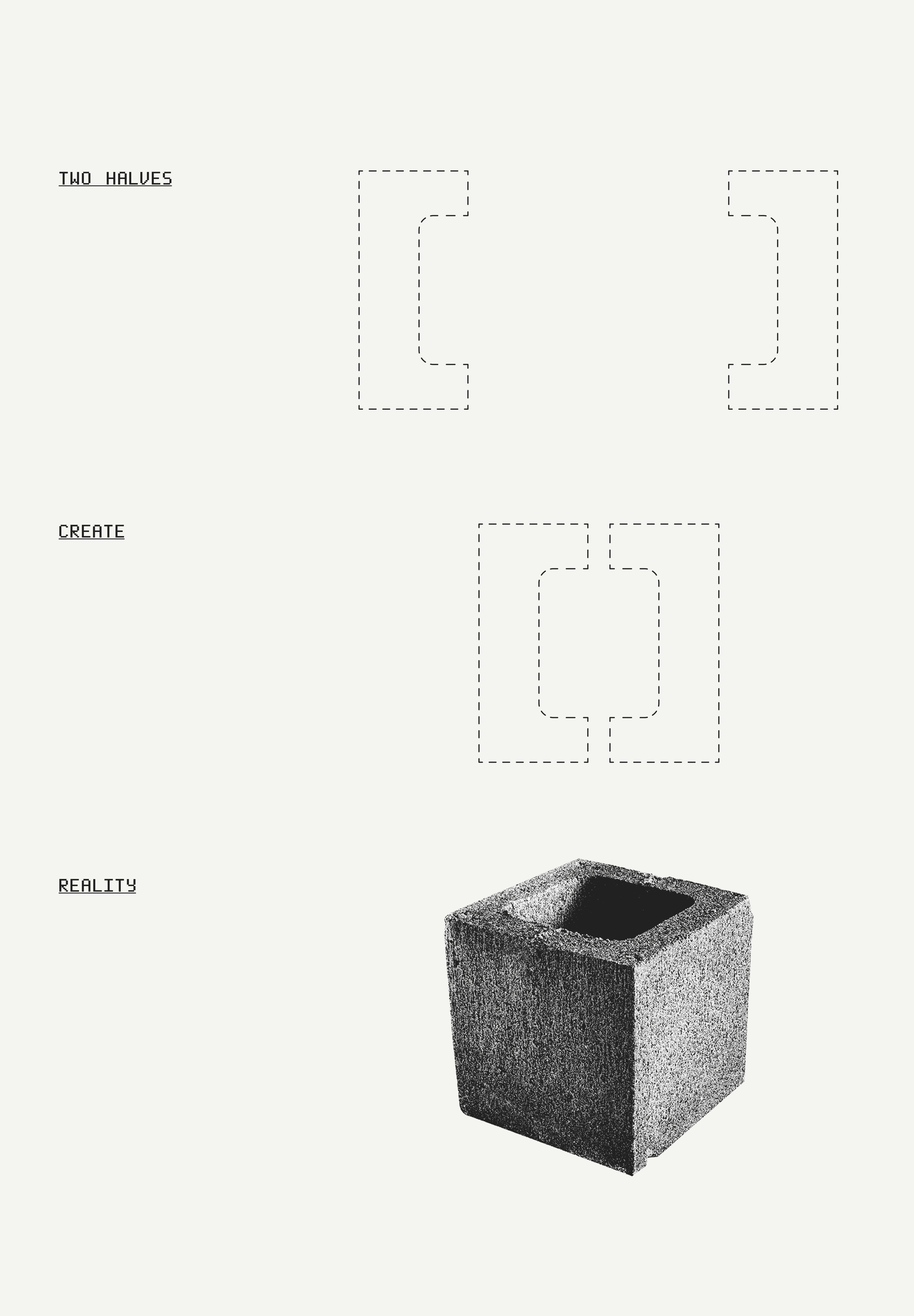
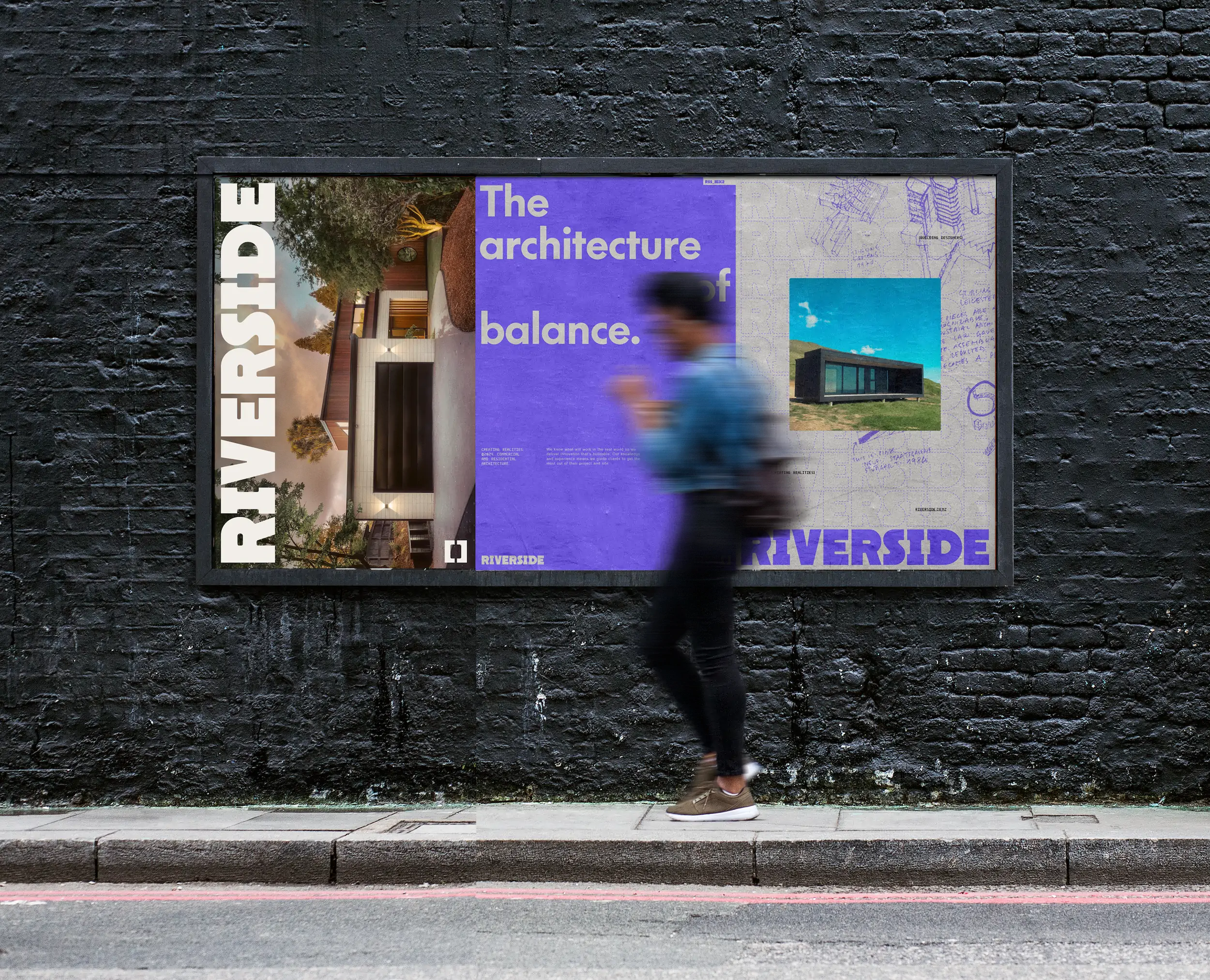
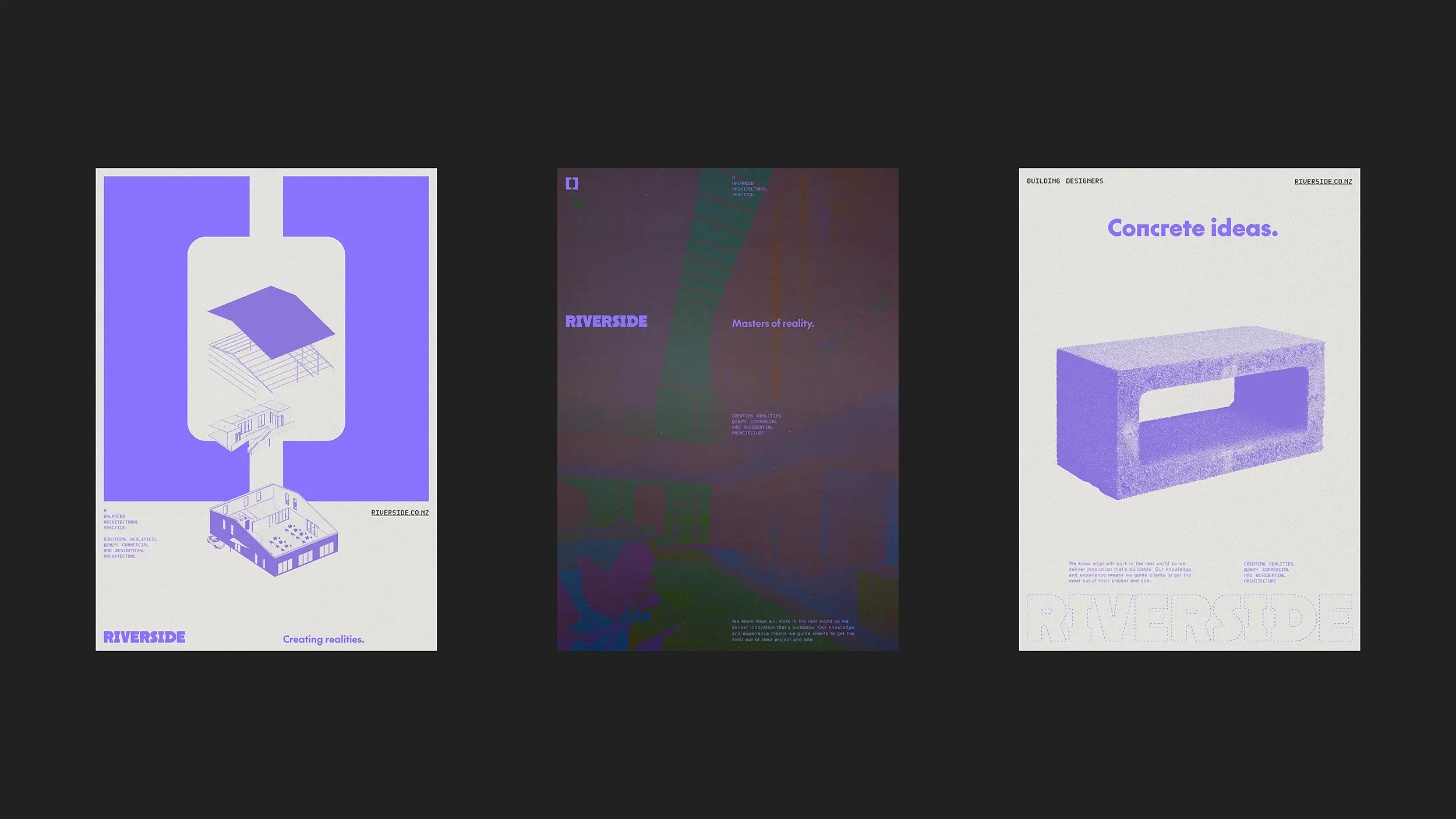
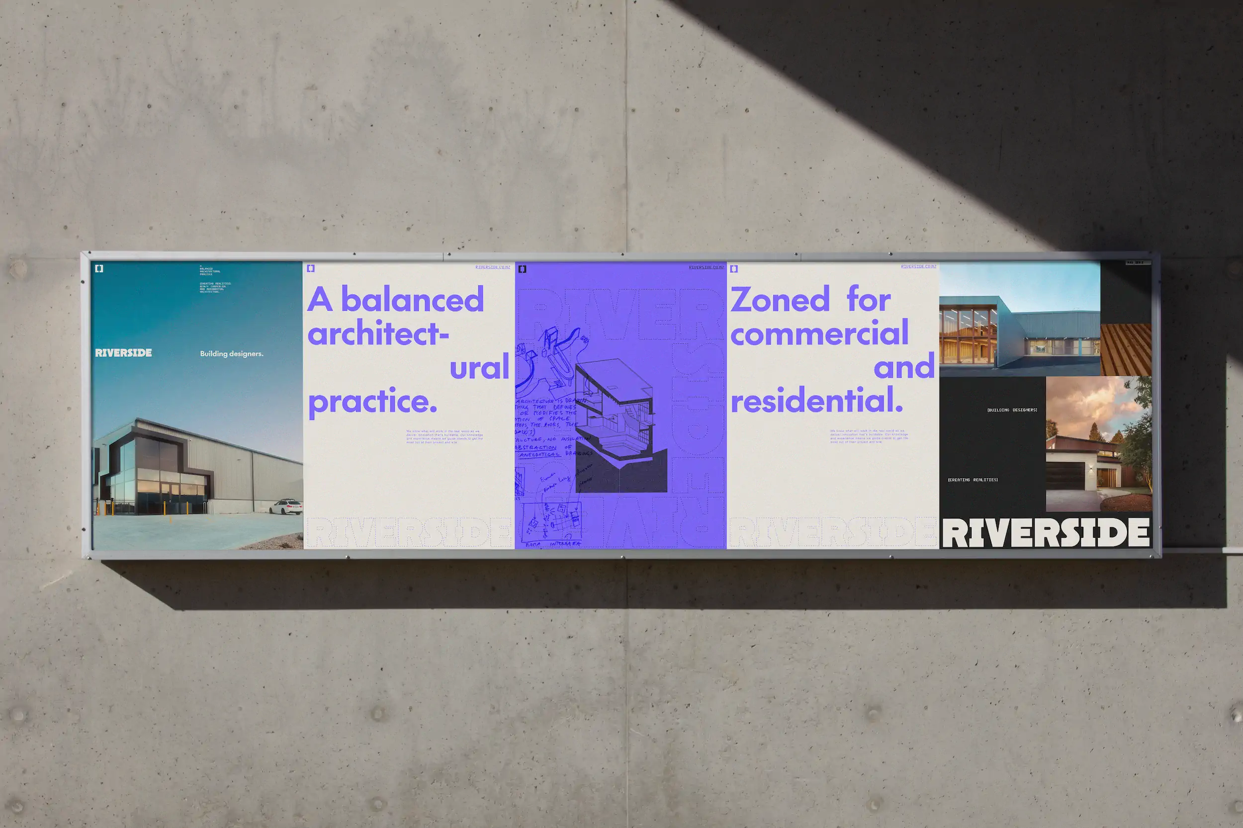
"Creating Realities" positions Riverside as architects who bridge creative vision and practical execution. The brand personality - "Creatively serious, Innovative realists, Pragmatic dreamers" - captures their ability to deliver concrete solutions while maintaining creative distinction. Leaning into the idea of a "practice of two halves," the commercial and residential expertise are positioned as complementary disciplines that inform and strengthen each other rather than separate services.
The Solution
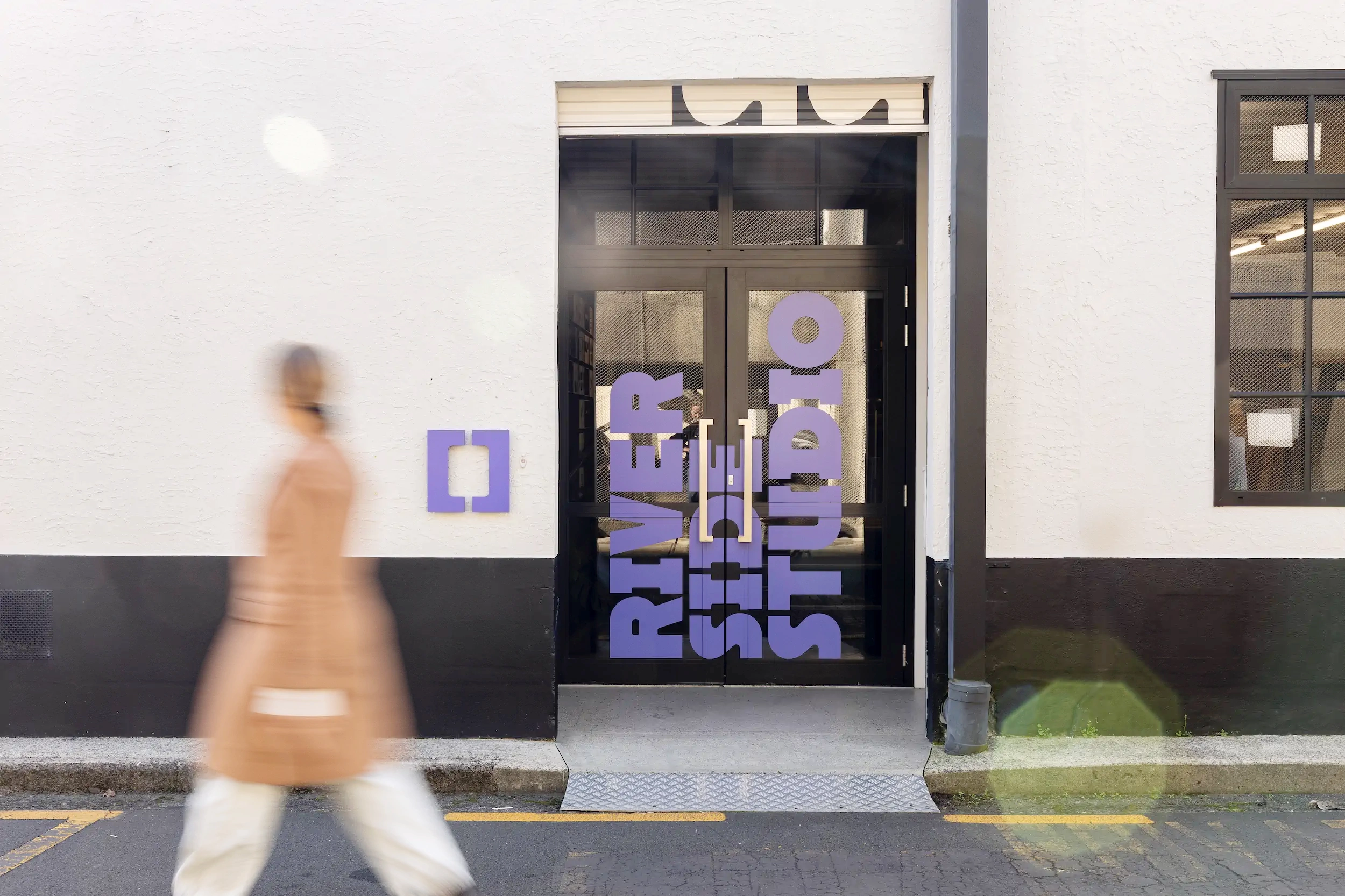
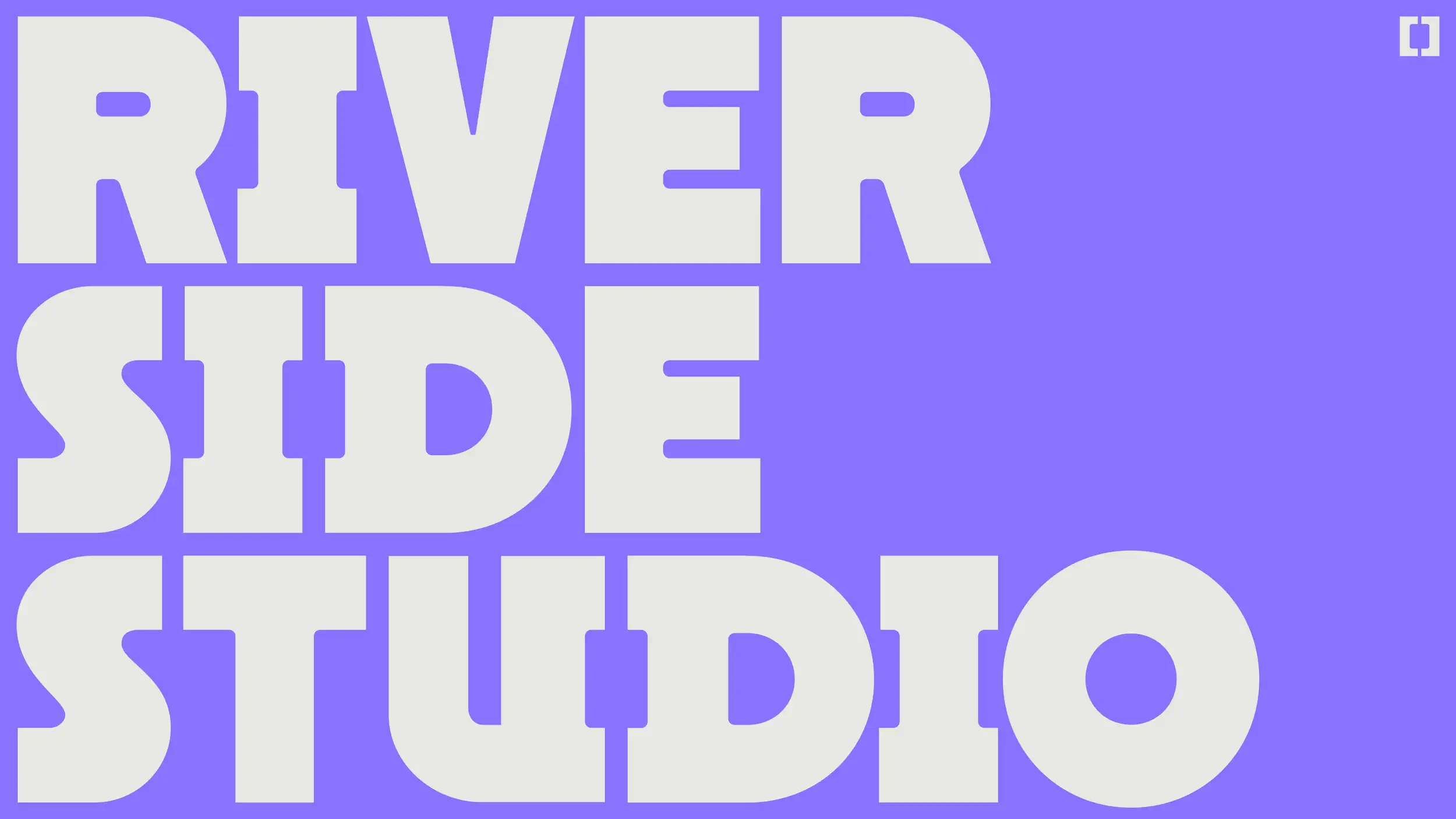
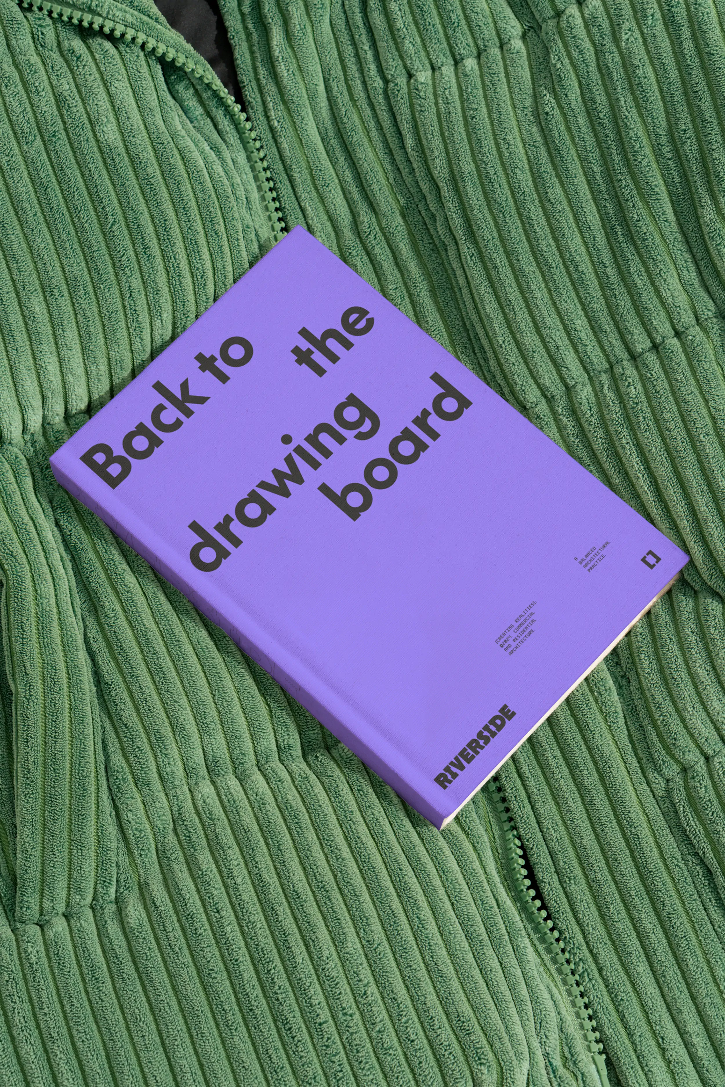
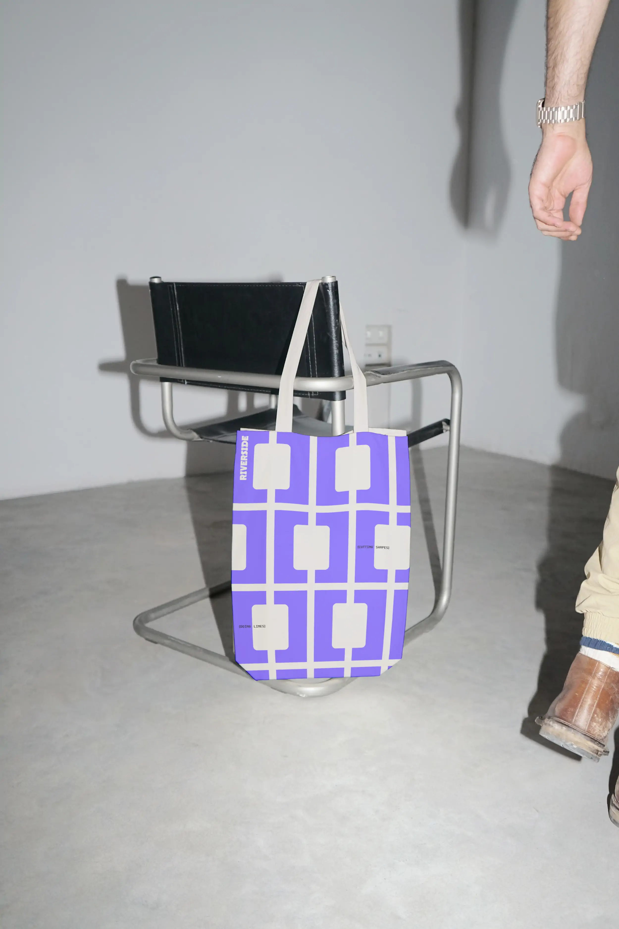
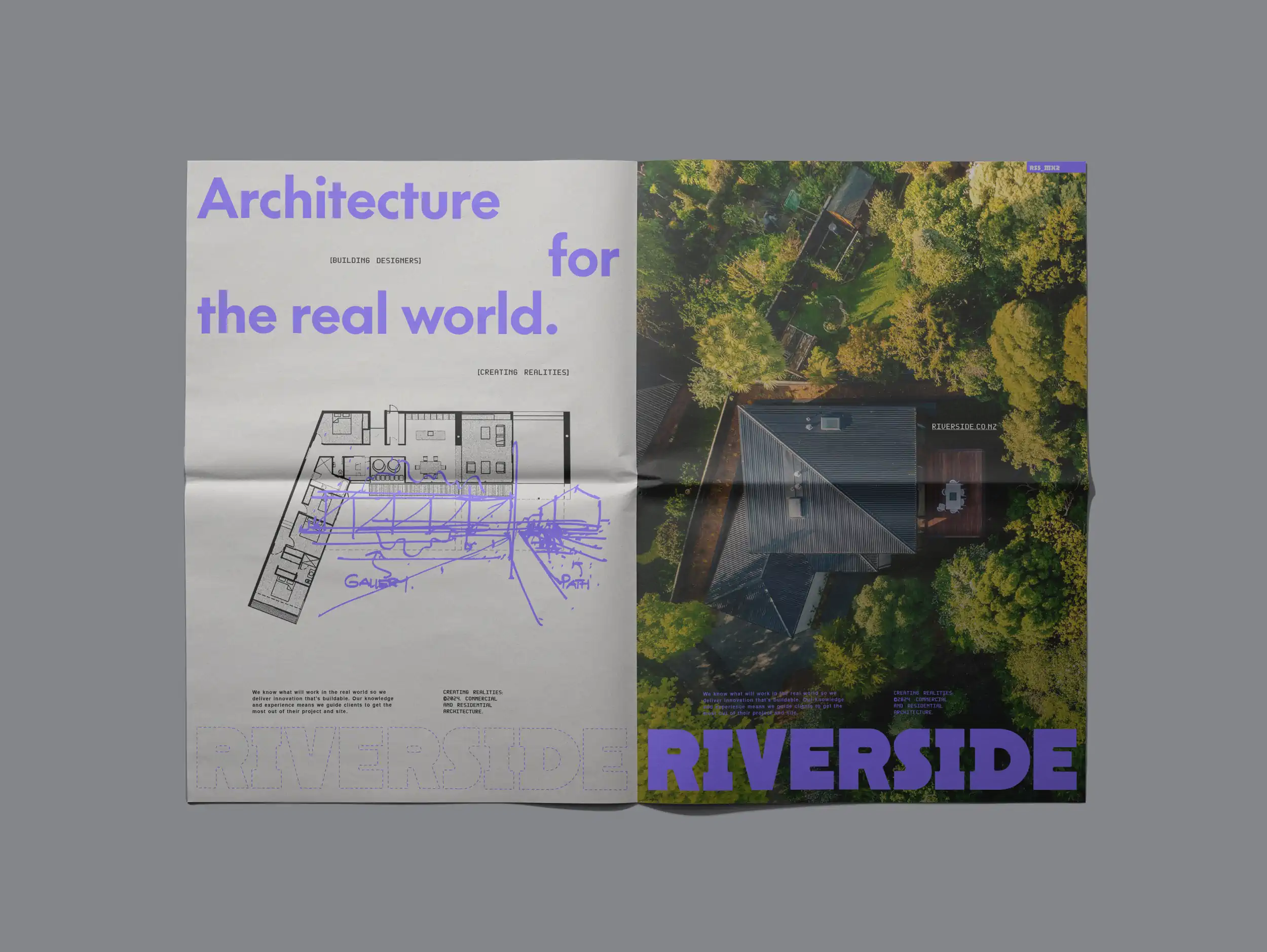
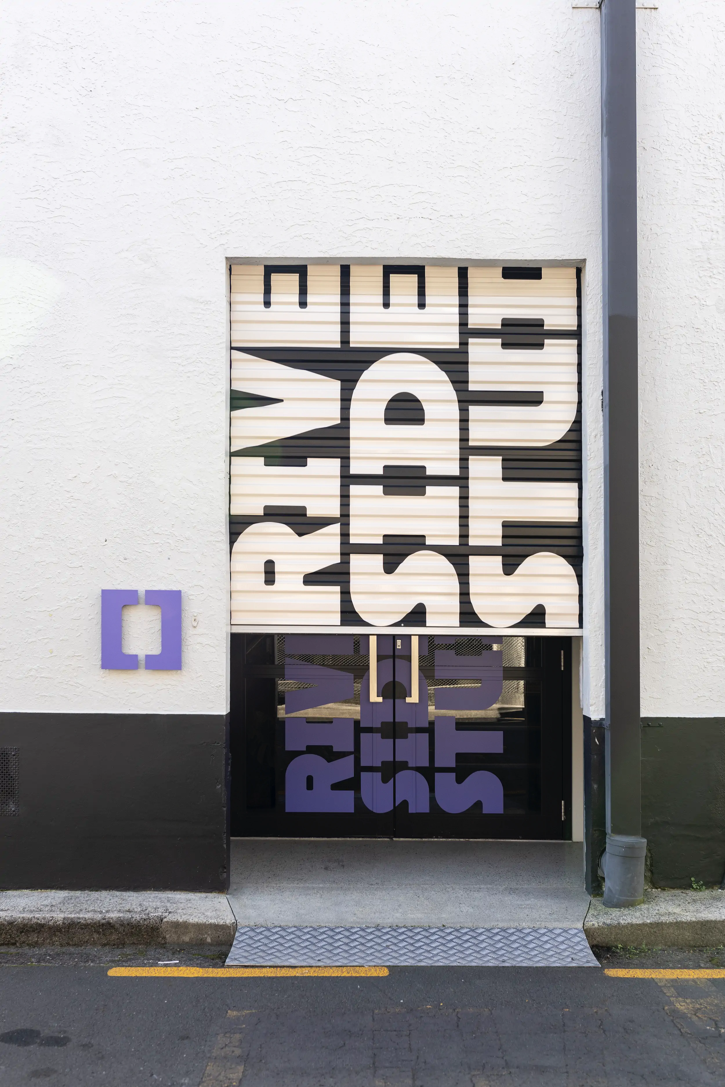
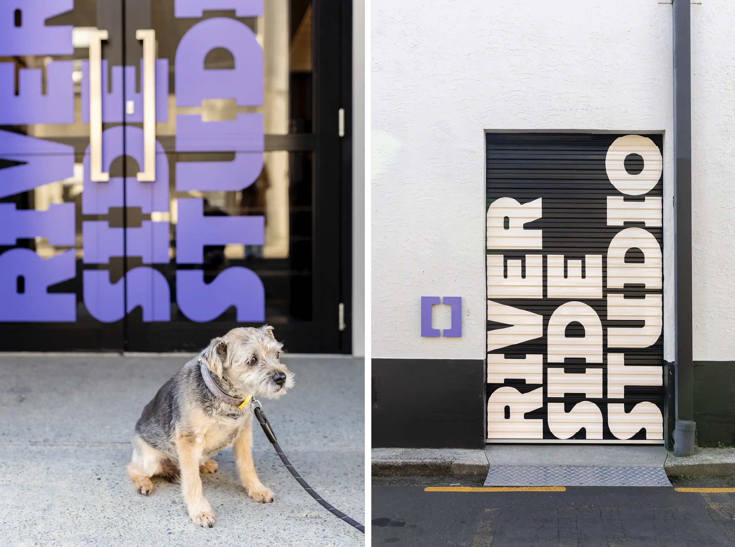
The Riverside identity is built on a balance of strategy and creativity. Strong typography and adaptable visual elements shift easily between expressive and functional, giving the brand presence across different audiences. The wordmark is set in bold, architectural letterforms—confident enough for commercial clients, while still approachable for new home builders. Its wider visual language takes cues from architectural conventions but pushes them further with dynamic, standout elements. The overall system holds a tension between technical precision and creative freedom, reflecting Riverside’s belief: understanding what works in the real world is what makes meaningful innovation possible.
The Website
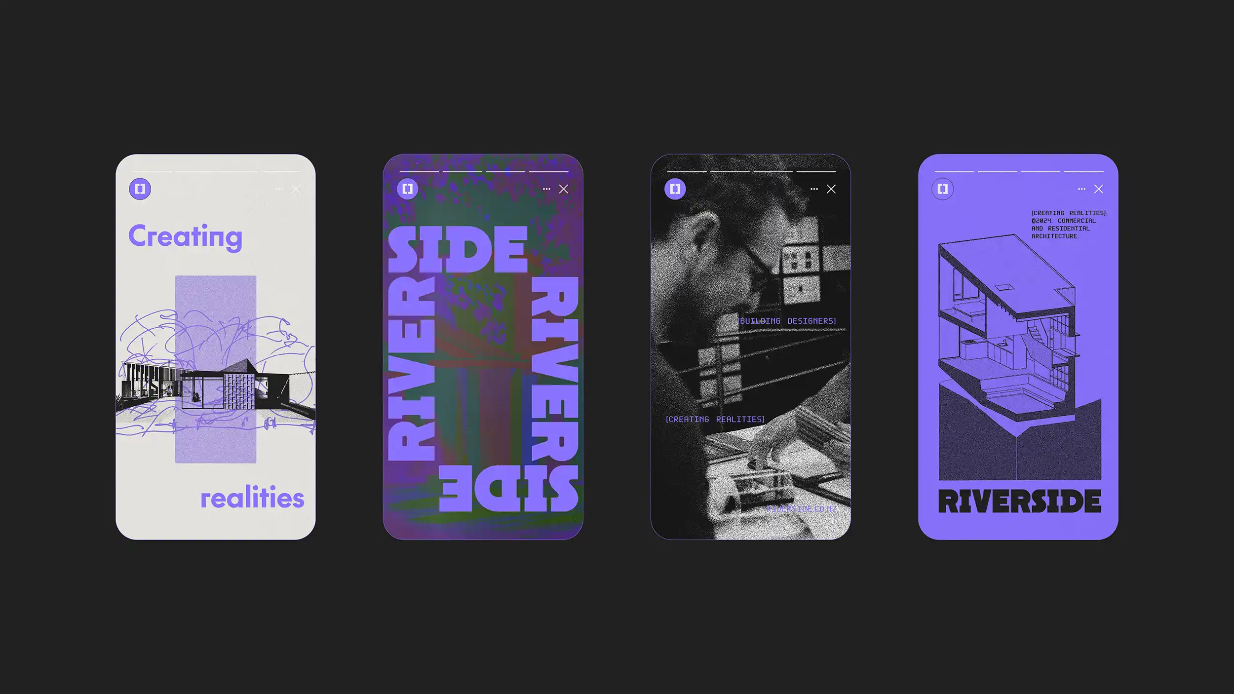
The website embodies the "practice of two halves" through visual composition and split-screen elements, while bold typography and architectural imagery reinforce the professional credibility across both sectors. Gritty textures contrasted with smooth interactive elements bring the design process to life and nod to the realities being created.

Credits
Data Mono by Dum Dum Studio
The Future by Klim Type Foundry

©MMXXII Daymark Studio Ltd, all rights reserved. Privacy Policy.
